
Classifying Real Diaster Tweets using Natural Language Processing
Twitter has become an important communication channel in times of emergency. The ubiquitousness of smartphones enables people to announce an emergency they’re observing in real-time. Because of this, more agencies are interested in programatically monitoring Twitter (i.e. disaster relief organizations and news agencies).
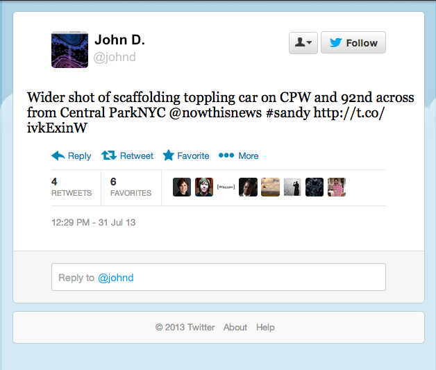
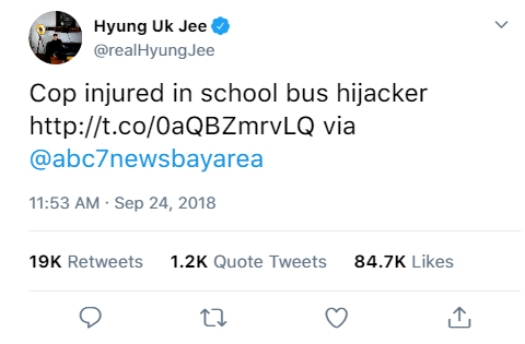
But, it’s not always clear whether a person’s words are actually announcing a disaster. Twitter has become an important communication channel in times of emergency. The ubiquitousness of smartphones enables people to announce an emergency they’re observing in real-time. Because of this, more agencies are interested in programatically monitoring Twitter (i.e. disaster relief organizations and news agencies). But, it’s not always clear whether a person’s words are actually announcing a disaster. The author, in the example above, explicitly uses the word “ABLAZE” but means it metaphorically. This is clear to a human right away, especially with the visual aid. But it’s less clear to a machine.
Source: Kaggle
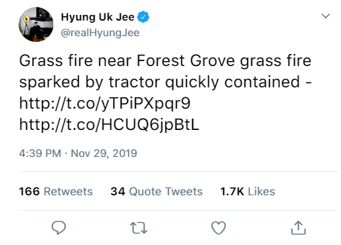
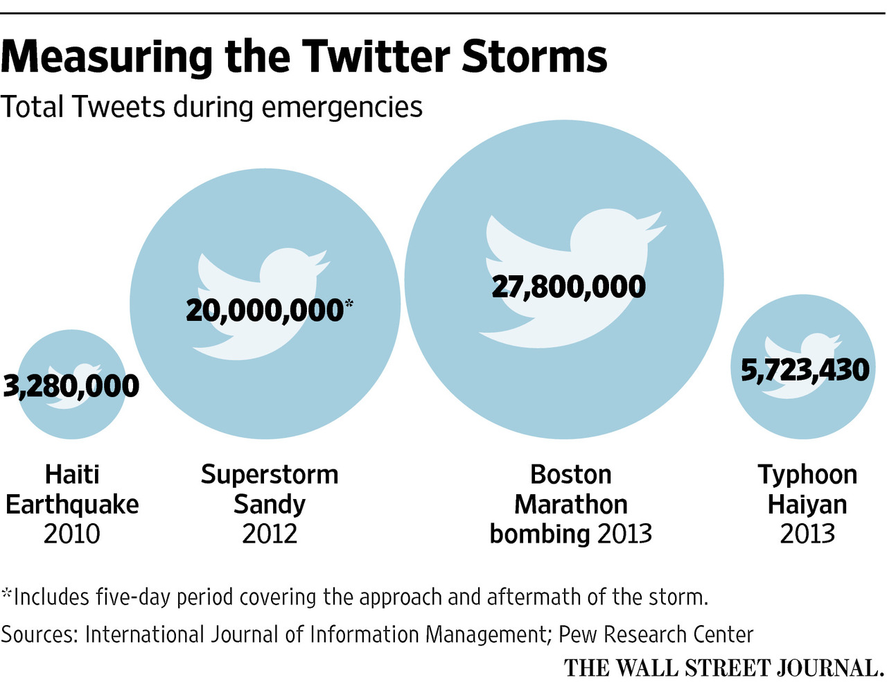 Researcher have found a direct correlation between
the volume of Twitter activity in an area affected by Superstorm Sandy
and the severity of damage suffered. This could help emergency personnel more
efficiently serve residents in future disasters.
Researcher have found a direct correlation between
the volume of Twitter activity in an area affected by Superstorm Sandy
and the severity of damage suffered. This could help emergency personnel more
efficiently serve residents in future disasters.
Source: The Wall Street Journal 2016
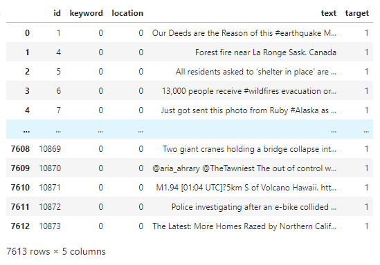
Data Description
Assumption
The researchers at the Commonwealth Scientific and Industrial Research Organization in Melbourne, Australia have found a correlation between an influx of tweets concentrated on an area and the severity of the situation. The surge, explained by The Wall Street Journal, can be helpful to first responders to assess the emergency during a disaster. In fact, researchers have found that the online Twitter response to the 2012 superstorm Sandy was a drew clearer picture of the local damages than federal emergency estimated. As social media now plays a major role in online communication, it is only natural that scholars and practitioners accept Twitter as a key channel to gauge a situation more deeply and dynamically compared to traditional channels.
Twitter gains alot of mentum on their platform because they promote human interaction and connectivity that is publically available for anyone can share their minds in various types of media. The social media is hyper-efficent outlet to share information between humans, in ways humans can understand each other, but it is a challange for machine to interprate for those who are interested in monitoring and assessing a particular situation. With the datset that was provided by the host of this competition, We will attempt to extract features that make up a disaster tweet from those that are not using a machine learning technique known as natural language processing. The information provided is not specific to a particular diaster, timeframe or location. Also, we will not be incorporating any other information other than what was provided, which is strictly tweets in text format.
Goal
The goal for this study is to classify which tweets are about real disasters and which one's are not by training a statistical learning model using a dataset of tweets.
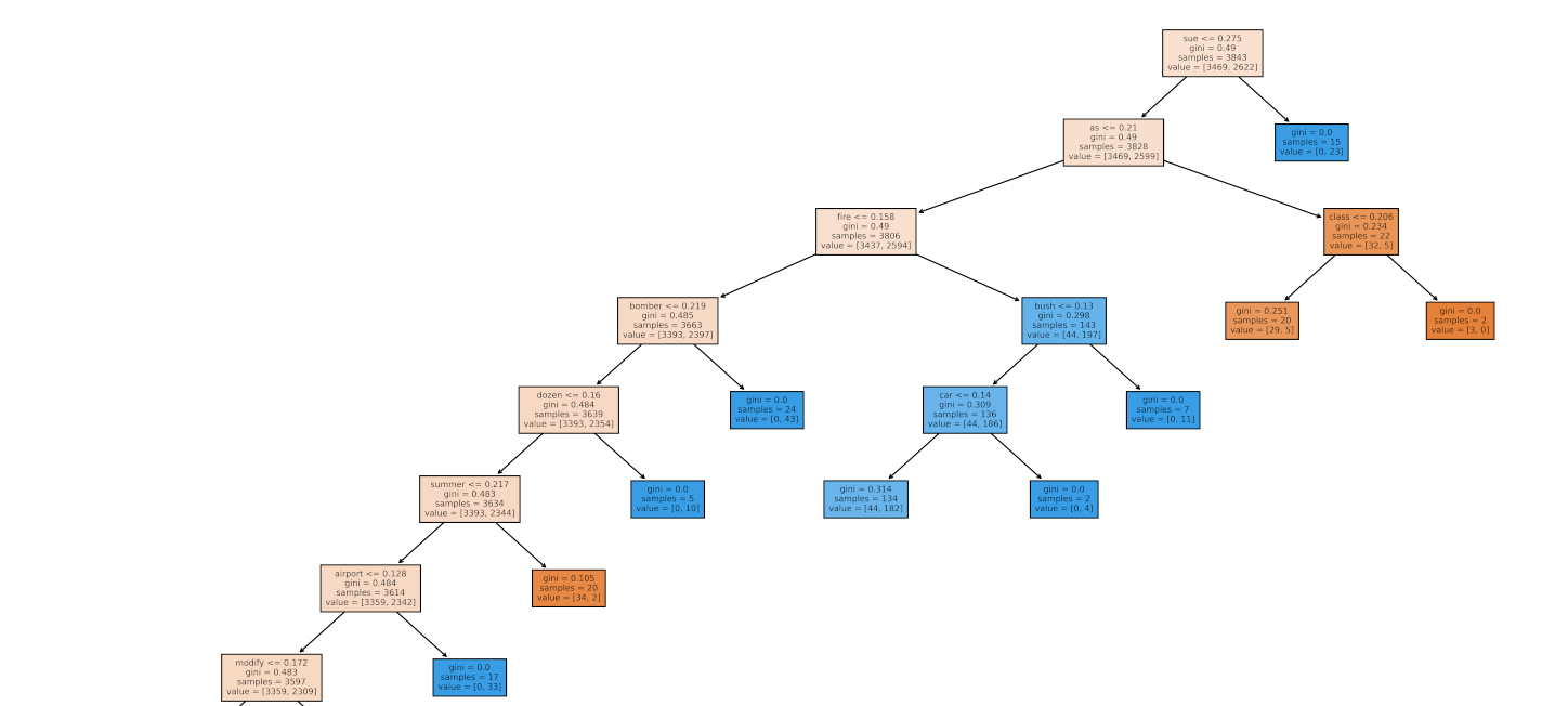
Random Forest Classifier Model Diagram
Approach
For a better understanding our process, let us take a step back and go back to our earlier days in school, where we learned about many rules to keep in mind to read and write the English language. We also learned about the idea behind different components within each rule. For example, a basic rule to follow to express a complete thought in a sentence is we must be able to break it into two essential parts: a subject that represents someone or something, and a verb that describes what the subject is being or doing. Without going into too much detail, these components might include he use of punctuations, pluralization, verb tenses, and many more. As we become more educated, the ideas that we would like to communicate get bigger and more complex, and two essential parts of speech can no longer suffice. Consequently, our sentence constructions and vernacular more complicated as we incorporate a variety of components to express our minds clearly. Though some of highly educated individuals will be able to paint a picture with words, this phenomenon could also leave some people behind. It could mean that not everyone would be able to follow along with the rules, and have to spend a significant amount of energy and time unpacking the language. It could ultimately be a factor to understand the widening of gaps between the different education levels of readers.
This is an antithesis of why Twitter has become a crucial mass communcation tool in our lives. The social networking platform champions the fastest, and the most efficient way to connect with one another, share information, and most importantly reach a massive audience over the internet. This ideology is demonstrated by the use of various platform's features. With the help of hashtags and mentions, users can easily find topics that are of interest to them. In addition, the limitation on the number of characters in every tweet enables us to be more creative about how we convey our ideas in a more coherent, concise and elegent way for effortless reading. But most importantly, the popularity of the platform appeals to a broad readership, which enables to collect the overall consensus of responses.
Conclusion
Our exploration ends with an understanding how to break down a text data such as a Twitter feed. This break down has three major parts. These parts include different types of Twitter features, several components of a sentence construction, and the distinct measure of readability for every tweet in the dataset. Furthermore, we are going to train our classification model using the information gathered from every part of the break down. With this trained model, we will able to successfully classify each Twitter feed into two distinct categories of whether it is regarding a real disaster or not with an 80% accuracy. Lastly, we will generate randomly assembled tweets from a lexicon for each classification to demonstrate our achievement.
Walkthrough
∘ Define Data Path
∘ Import Libraries
∘ Define Regular Expression Functions
∘ Define Word Manipulation Functions
∘ Define Dictionary Search Functions
∘ Define ML Model Functions
∘ Define Word Frequency Plotting Functions
∘ Define Model Validation Plotting Functions
∘ Perform Data Acquisition and Preparation
1. Define DataFrames, Features and Target
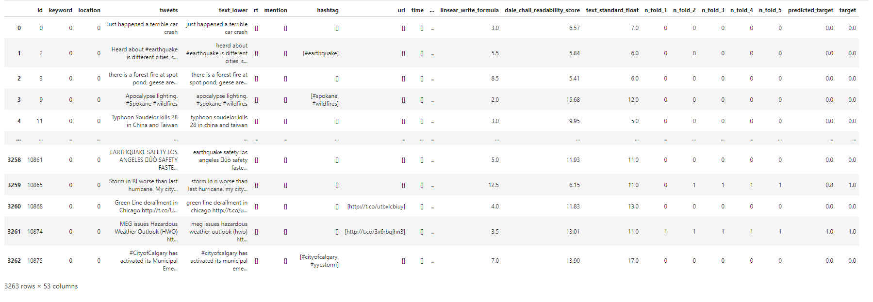
Files
Columns
Acuire Train Dataset and Transform DataFrame
∘ Retrieve Original Sample Train DataFrame
∘ Transform Categorical Features in Train DataFrame
∘ Transform Categorical Features into Numerical Features in Train DataFrame
∘ Transform Categorical Features into Numerical Features as Readability Index in Train DataFrame
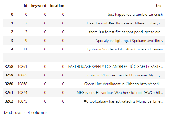
Acuire Test Dataset and Transform DataFrame
∘ Retrieve Original Sample Test DataFrame
∘ Transform Categorical Features in Test DataFrame
∘ Transform Categorical Features into Numerical Features in Test DataFrame
∘ Transform Categorical Features into Numerical Features as Readability Index in Test DataFrame
∘ Transform DataFrame to Fit Our Model
Feature Processing Flow Chart
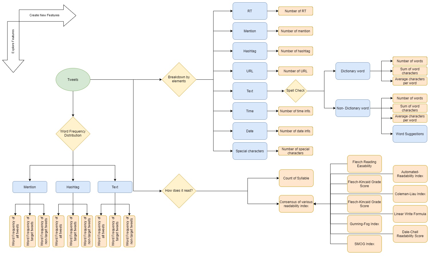
The dataset breaks down the tweet into several key components such as the location where it was tweeted, a particular keyword that is highlighted, and a classification whether the content is regarding an emergency situation. Before we proceed with exploring the data, we need to be knowledgable about the basic anatomy of tweets. A typical tweet might contain information on whether it has been re-posted from another user known as re-tweeting or RT, a call for an attention to another user known as mention or at sign followed by an user id (@ user id), a call for an attention using a relevent keyword or phrase to be easily searched known as hashtag or hash sign followed by a keyword (# keyword), and an option to add geographical information metadata known as geotagging or location tagging. In addition to these building blocks, users can take advantage of various forms of media such as a hyperlink, photos, and videos. For this study, however, we are only going to work with elements with texts. The above demonstrates the break down each tweets into its different anatomical elements.
∘ Analyzing Word Freqeuncy Distributions by Target Value
∘ Word Frequency Distribution DataFrame
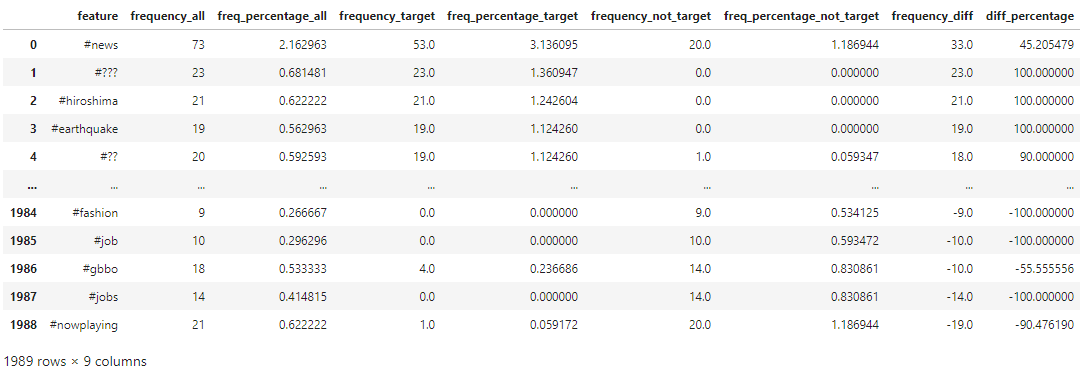
∘ Hashtag Frequency Distribution DataFrame
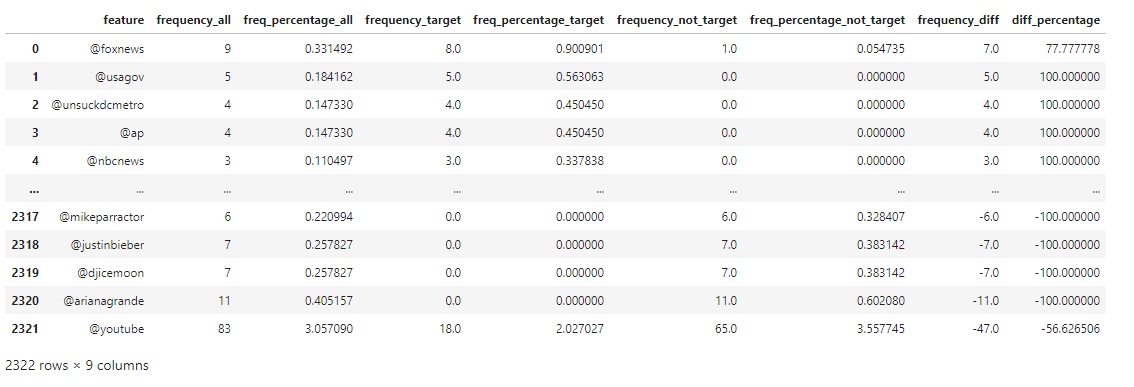
∘ Mention Freqeucny Distribution DataFrame
Feature Freqeuncy Scatterplots
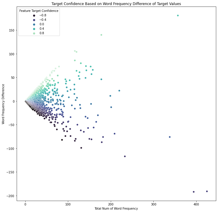
∘ Interactive Target Confidence Scatter Plot on Word Frequency
Click Here to View Interactive Target Confidence Scatter Plot on Word Frequency
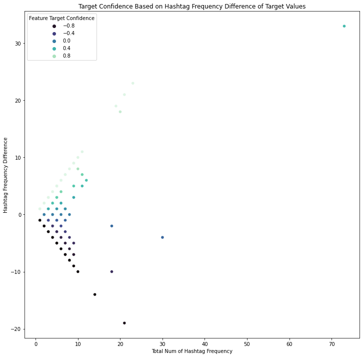
∘ Interactive Target Confidence Scatter Plot on Hashtag Frequency
Click Here to View Interactive Target Confidence Scatter Plot on Hashtag Frequency
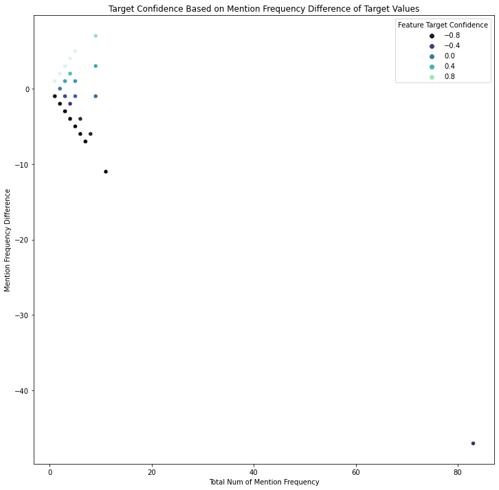
∘ Interactive Target Confidence Scatter Plot on Mention Frequency
Click Here to View Interactive Target Confidence Scatter Plot on Mention Frequency
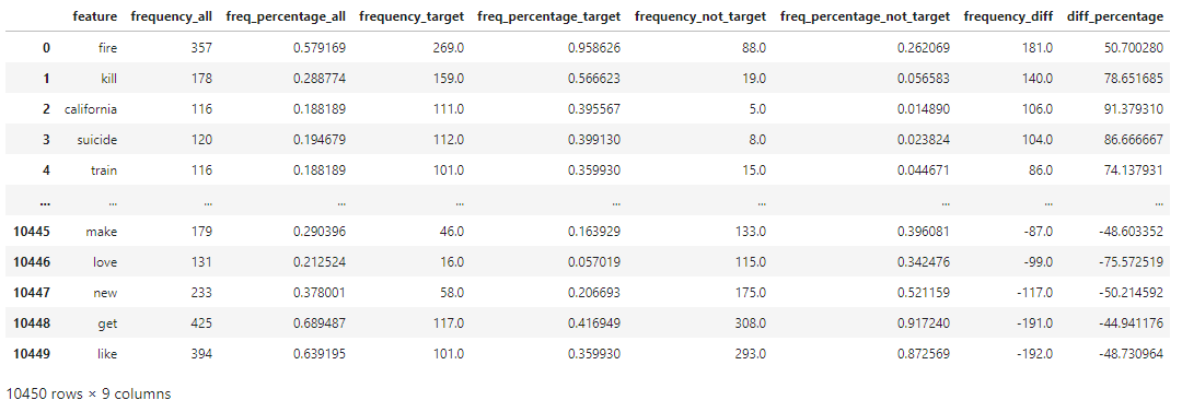
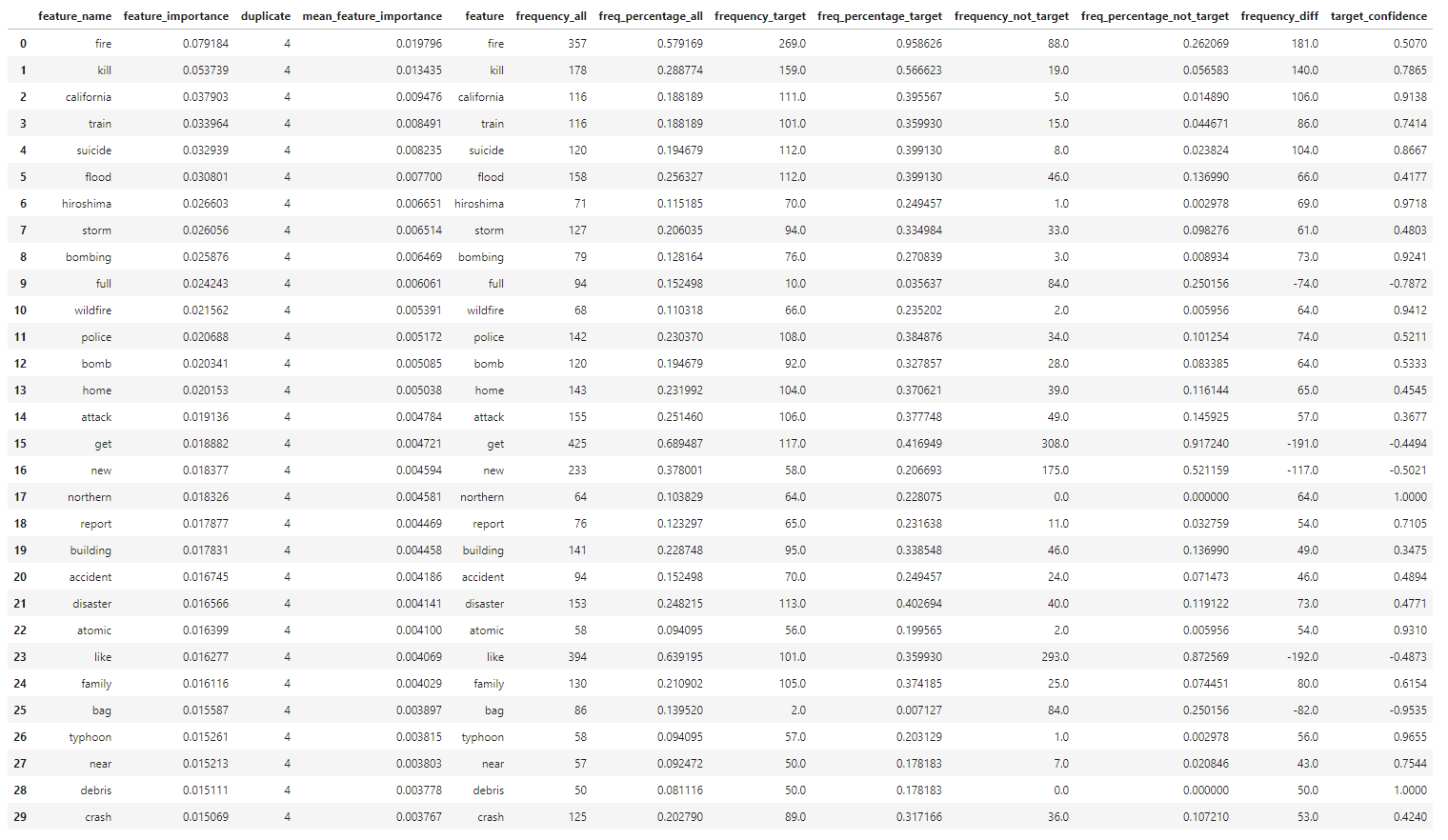
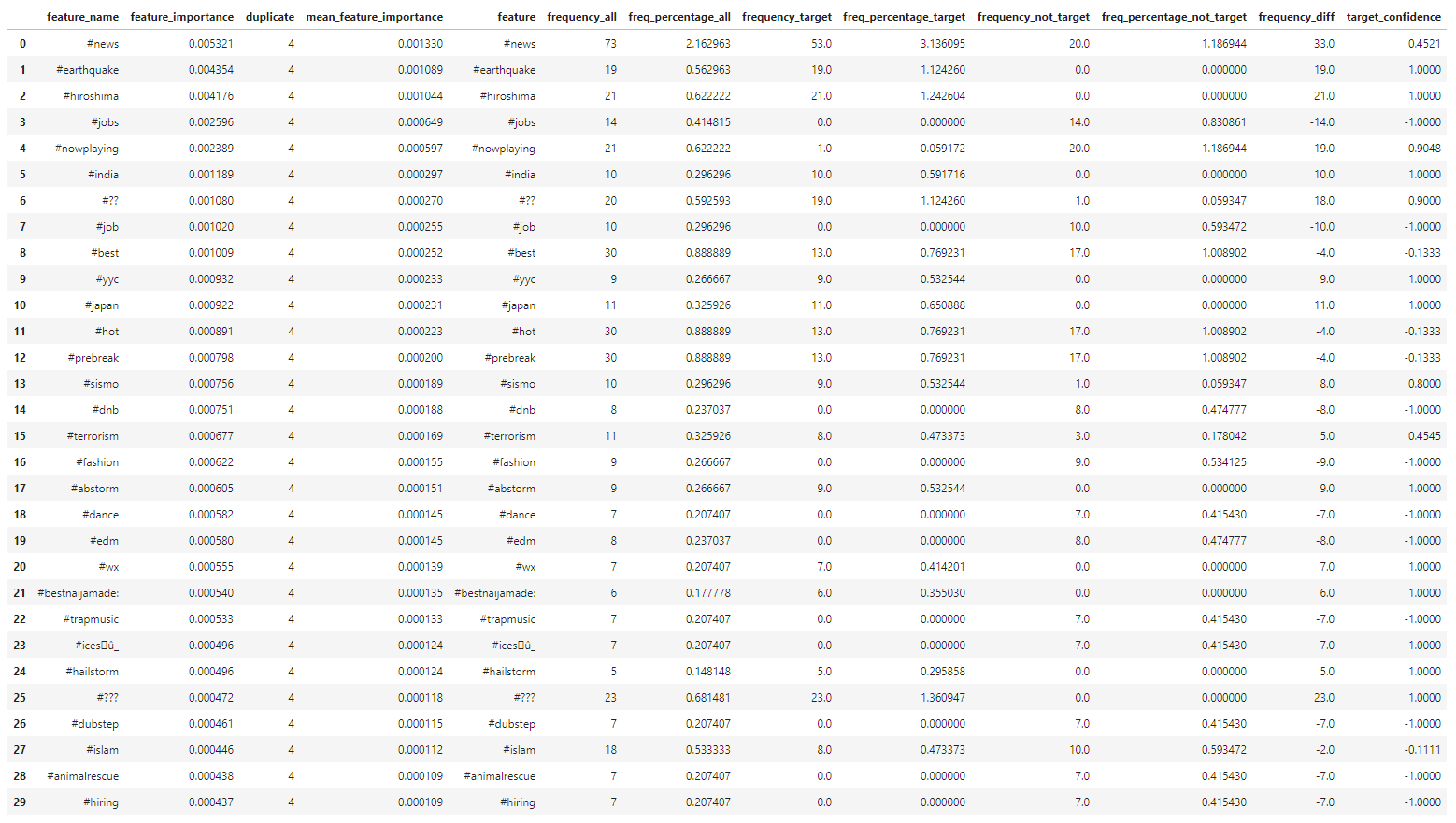
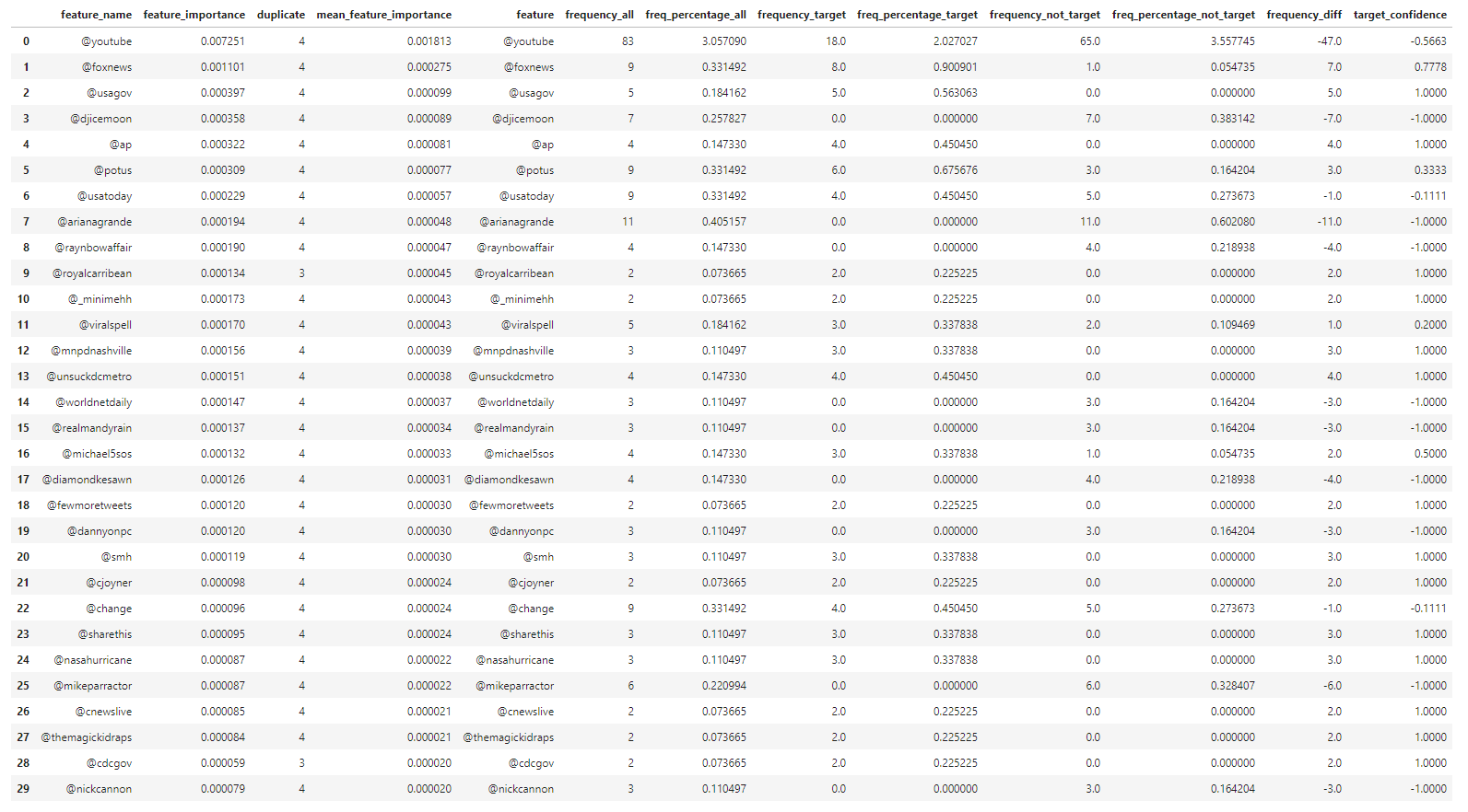
Our exploratory data analysis begins with understanding the difference in the frequeny of words or phrases between tweets regarding real disaster versus those that are not. In my personal experience with Twitter, the validity of the information shared on the platform can be determined by not only the information itself, but also the user account who have posted or originally posted it, the call for attention to, or from a user or group of users by utilizing mention and hashtag, and the media that are being shared. For this study, these can be categorized as words, hashtags and mentions in each tweets used in both of our target values. As shown above, we can organize the frequency of each component of tweets in three parts: 1. the frequency of a particular word or phrase in all of the tweets; 2. the frequency of those in the category of real disaster tweets; 3. the frequency of those that are non-urgent matter. With this information, we are able to study the frequency difference of those that are observed in both target categories to calculate the confidence in percentage of a particular tweet to be categorized as our target value. For example, the word 'fire' comes up 357 times in our training data. 75% of the time the word was tweeted was during an actual emergency situation. On the other hand, the frequency of the word 'like' is 394 times. Only 25% of the time the word was tweeted was not during a dire situation. We can also explore this idea further down with the frequency of other elements such as hashtags and mentions.
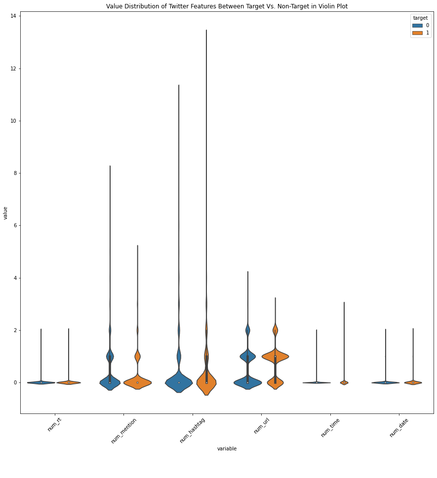
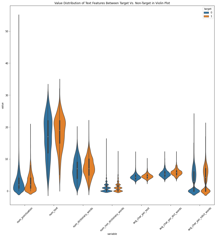
∘ Exploring Text Metadata and Readability Scores
Value Distribution of Features Between Target Vs. Non-Target Values
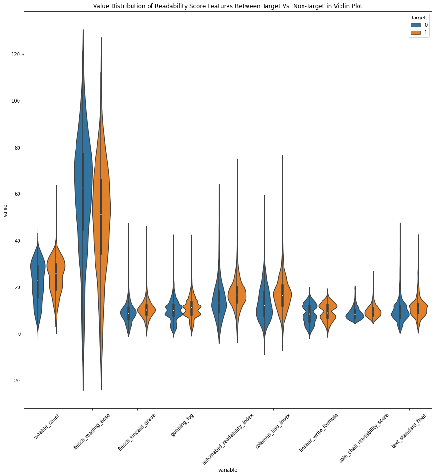
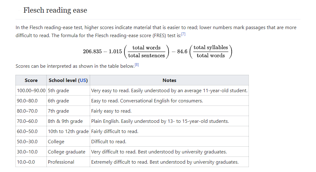
∘ Introduction to Flesch Readability Index
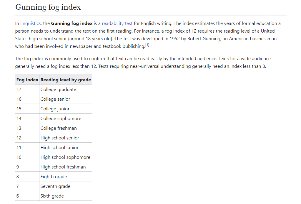
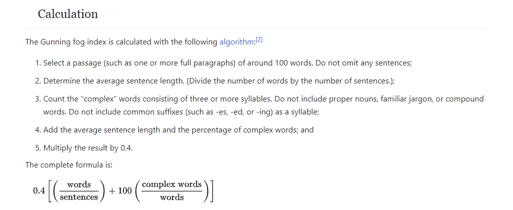
∘ Introduction to Gunning-Fog Readability Index
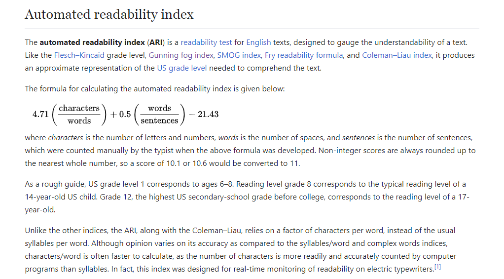
∘ Introduction to Automated Readability Index
Next, we will be extracting information about the sentence structure of each tweets. We will be breaking down each tweet by three major parts. These parts include types of Twitter features, components of a sentence construction, and measure of readability. If we take a look at the comparison of value distributions of each part individually, we find that there is a very subtle differences in average values between both target values. For example, there is no significant differences between the number of various types of Twitter features between target and non-target values. In addition, we can see similar results in a number of readability indexes. However, we also find that there is a significant differences in the spread of the values. We can observe a wider spread in the number of punctuations in non-target values than that of target values. We can also see a similar results in number of hashtags, average characters per non-dictionary words, and the consensus of readabiliy scores. Overall, observing the distributions of values suggest that this analysis alone may not be a viable analysis to classify what is our target or non-target values.
∘ Graphing Correlation Between Text Metadata and Readability Scores
Correlation Between Categorical Features Metadata Vs. Readability Scores

∘ Correlation Between Categorical Features Metadata Vs. Readability Scores
The evidence that exploring a simple linear relationship between text medata and readability scores between target and non-target values would also not be a viable analysis is more apparent noting the correlation between them. First, we can observe strong positive correlation between Linsear Write readability score and syllable counts, the number of text and the number of text characters in a sentnece. However, this is the only significant observation of correlation between a readability score and text metada. This can be noted due to a variety of unique requirements for each readability score that cannot be captured when a text is dissasembled by components. Overall, the observed correlations between our defined features have weak linear correlations.
2. Perform Manual Parameter Tuning for Better Model Fit
∘ Define Preprocessing Transformers and Pipeline
∘ Define Each Model Parameters
The model we are fitting for this prediction model is Random Forest Classifer from Scikit-Learn. The varsatility of an ensemble of forest algorithm is very impressive and handles bias and variance very well. However, we have to be very careful not to overfit the training data, which happens quite often. So, my proposed solution is to perform a very broad range of each parameter to see the effect on the predictive accuracy, and determine which combination of parameters result in underfitting or overfitting prediction model. Later, we can narrow down our combinations of parameters to a set of select few depending on the performance of our initial fitting. Finally, we will be using this smaller set of parameters to fit a more aggressive fitting to find the best estimator.
∘ Plotting Fit Performance Using Accuracy Score and Percent Difference
∘ Determine Fit Performance with Accuracy Score DataFrame For Better Fit
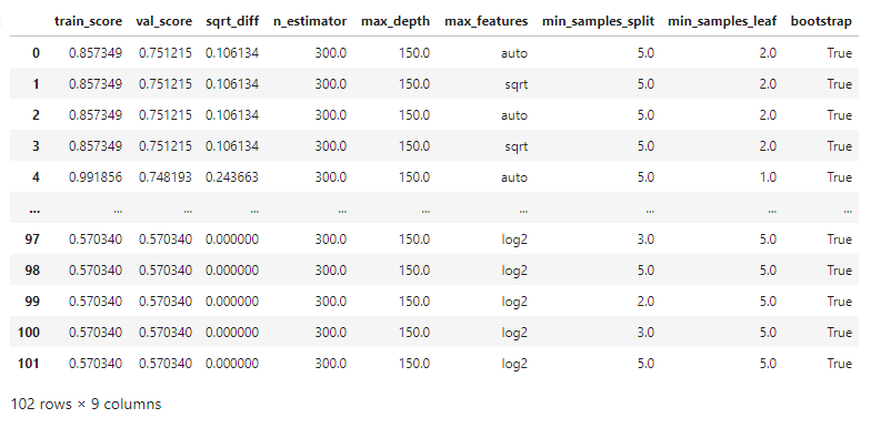
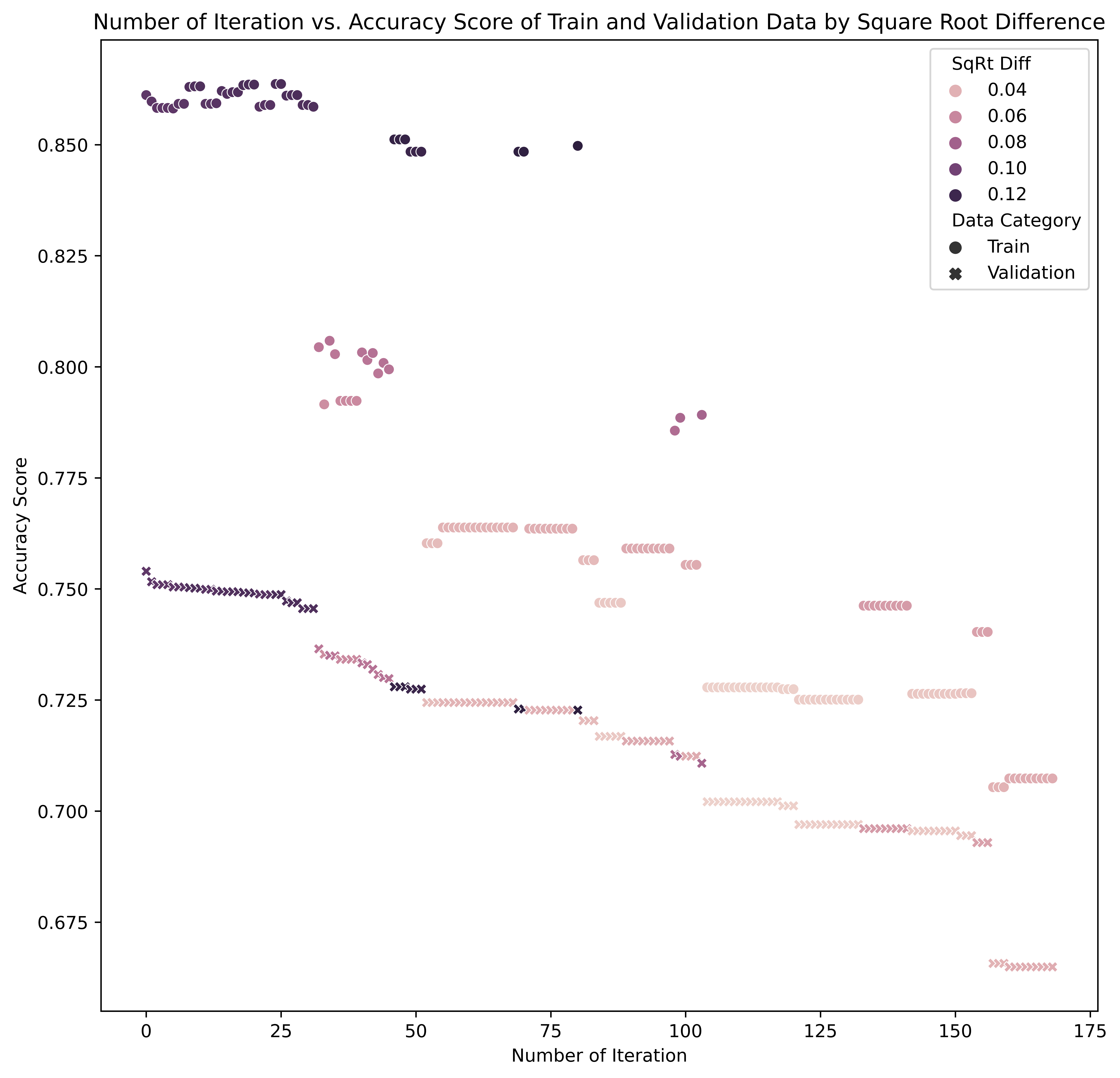
In this manual search, we are comparing the accruacy score of training data, and the out-of-box sample data for validation. The accuracy score is the percent deviation between the predicted target value and the actual target value. The accuracy score will help us determine better parameter combinations to fit our final prediction model with the best estimator. In the graph above, we are looking for parameter combinations that have the higher validation accuracy score and also have the smaller square root difference between training score and the validation score.
Here are the range of parameters in the "goldilocks zone" of bias-variance plot for this study:
- Num. of Estimators: 200 ~ 300
- Maximum Num. of Depth: 150 ~ 175
- Minimum Num of Samples Split: 2 ~ 5
- Minimum Num of Samples Leaf: 2 ~ 5
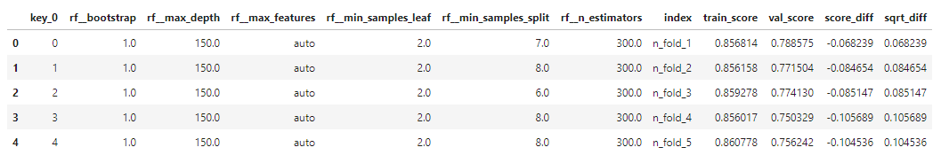
3. Improve Model Further with GridSearch and Cross-Validation Methods
∘ Define Parameters for Best Estimator
∘ Perform GridSearch Method, Model Fitting with Best Estimator, and Cross-Validate Fitting
∘ Determine Fit Performance with GridSearch Best Estimator and Accuracy Score DataFrame
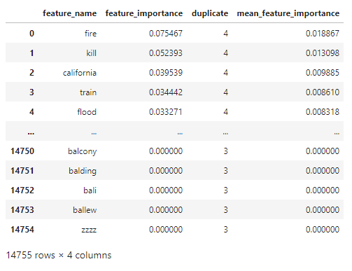
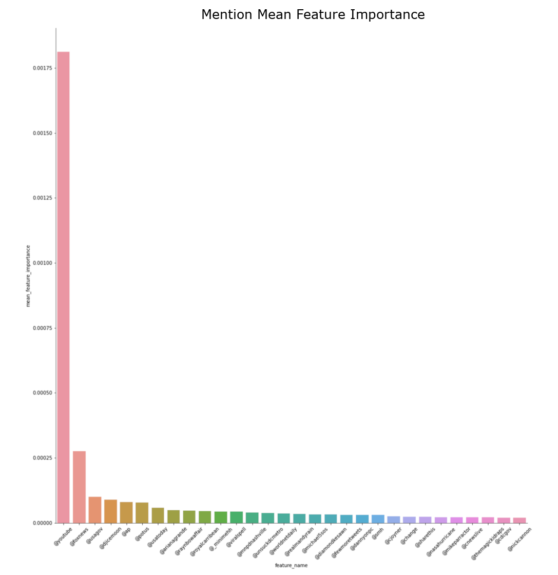
∘ Determine Feature Importance with Feature Importance DataFrame
∘ Make Predictions on Test Set DataFrame
Before fitting the model with a set of parameters, we now have a narrowed down set of parameter combinations from our initial parameter tuning. Furthermore, we will tune our prediction model with a more aggressive to find the best parameter to fit. We will be spliting our training data with shuffle split method inside and outside of the gridsearch for cross-validation. Next, we will fit the best estimator of our random forest regressor model. Lastly, we score our fit and the prediction values with accuracy score.
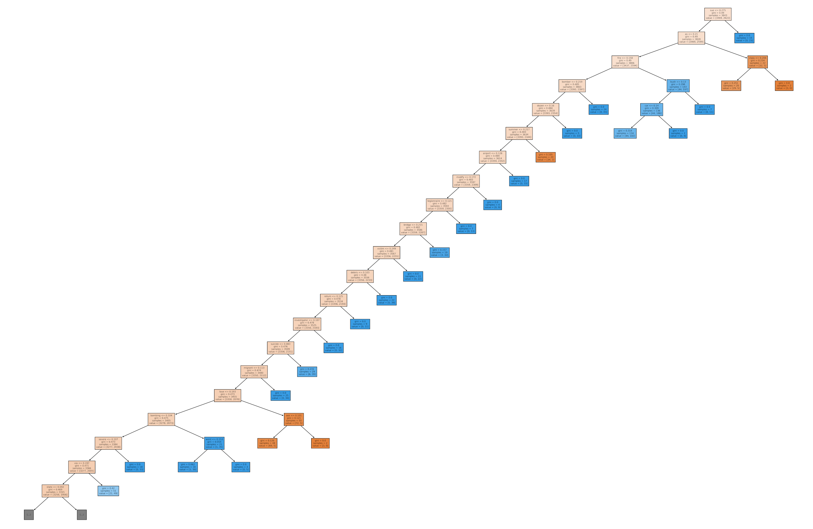
∘ Plotting Our Random Forest Classifer Model Fitted with Best Estimator On A Tree Diagram
Random Forest Regressor Model Diagram
∘ Correlation Between Categorical Features Metadata Vs. Readability Scores
∘ Plotting Feature Importance Bar Graph by Feature Group
∘ Compare Feature Importance and Target Confidence in Words
∘ Compare Feature Importance and Target Confidence in Hashtags
∘ Compare Feature Importance and Target Confidence in Mentions
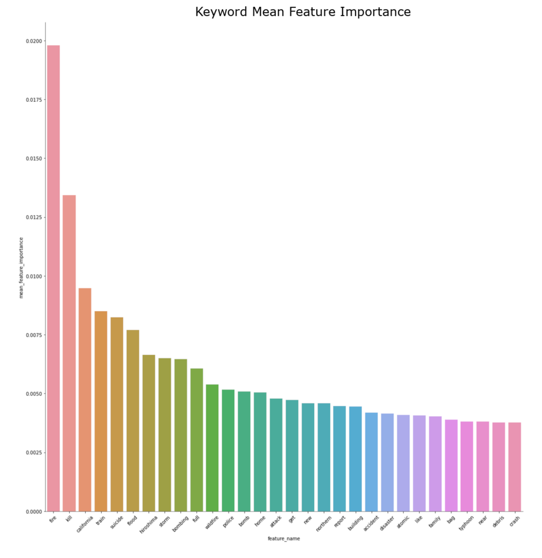
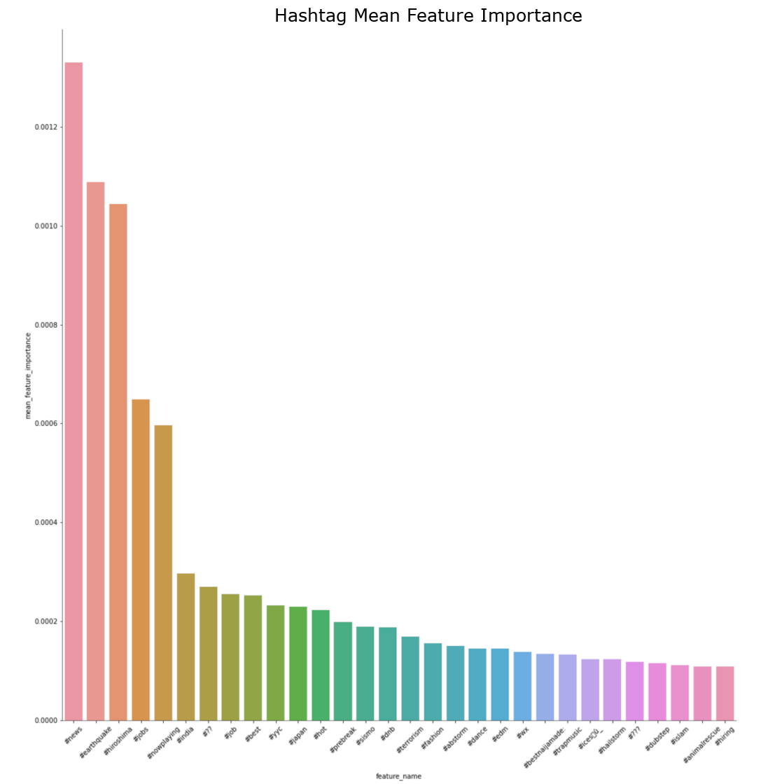
Random Forest Feature Importance Bar Charts by Feature Group
∘ Plotting Feature Importance Scatter Plot by Feature Group
Random Forest Feature Importance Scatter Plots by Feature Group
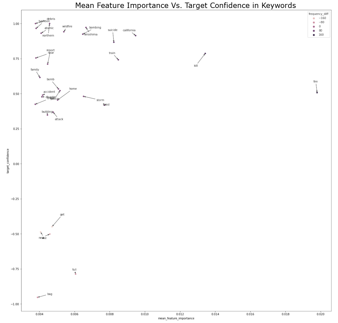
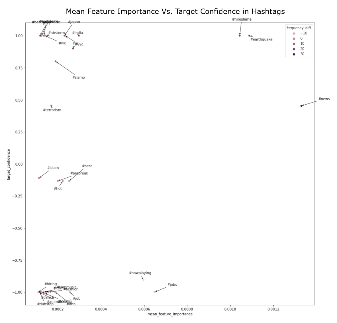
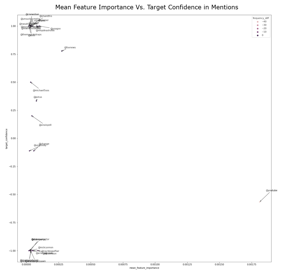
The feature importance percentage tells us that the percentage of how much the feature has the influence in our model to predict the test data. The feature with the highest feature importance is the word 'fire', followed by 'kill', and 'California'. However, we can note that the classifying features near the top of the hierarchy are 'news', followed by 'severe', and 'Reuters'. The relative position of the classifying feature does not necessarily mean that the feature is the more important feature in a predictive model, but rather more prominent classifying feature individually. Feature importance metric tells us the overall performance of each features, which could be used to classify in multiple decisions defined by the summation of Gini importance. However, the relative position of the decision tree hierarchy tells us that the performance of a classifying feature for a single classification defined by Gini importance. Thus, the word 'fire' has the highest feature importance, or largest summation of Gini importance, of the entire classifier model, but the word 'news' has the highest feature importance of an instance, or largest individual Gini importance. Using this information, we take most importance features from each feature group and compare them to the target confidence from our initial exploratory analysis. From here, we can estimate the overall confidence of target classification of individual features.
∘ Recreating Fake Tweets from Predicted Features
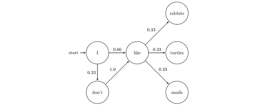
∘ Introduction to Markov Chain
Example of Markov Chain
Randomly Generated Tweet with Non-Target Lexicon

Randomly Generated Tweet with Target Lexicon

Finally, with everything that we learned about the training dataset, we can now apply our classification model to our unseen test dataset to classify whether each tweet in its dataset is regarding a real disaster situation or not. Next, we will gather all the words from every tweet, and separate them into two different bag of words by our prediction classifications. Lastly, we can recreate our own tweets with a lexicon from each classification using a Markov Chain algorithm. This will help us estimate the performance and our understanding of our results from the classification model.